Website design and UX strategy.
This client had an extremely old and tired/cumbersome website. See below for a quick homepage “before/after” image. It’s really just an example of how quickly the general rules known as “internet best practices” are changing. It’s a funny term, kinda like saying something is “contemporary” as if that’s a good thing.
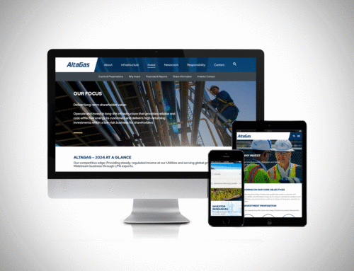
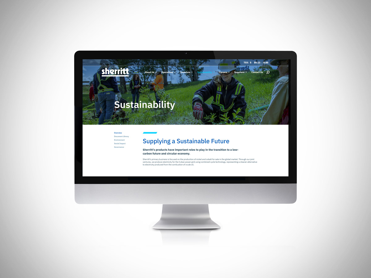
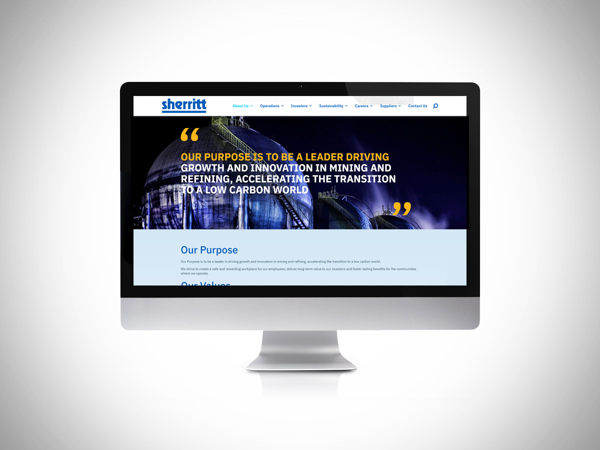
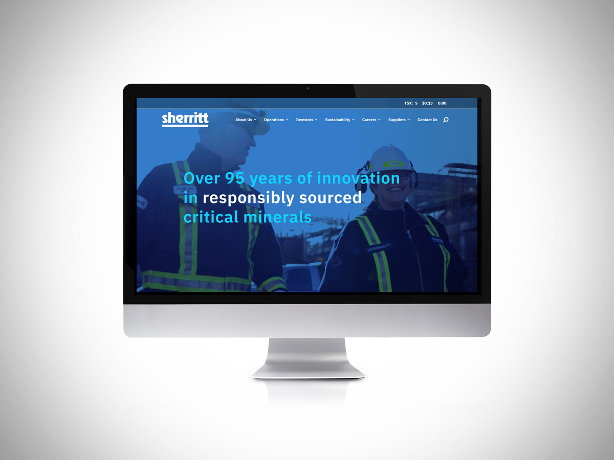 New Design
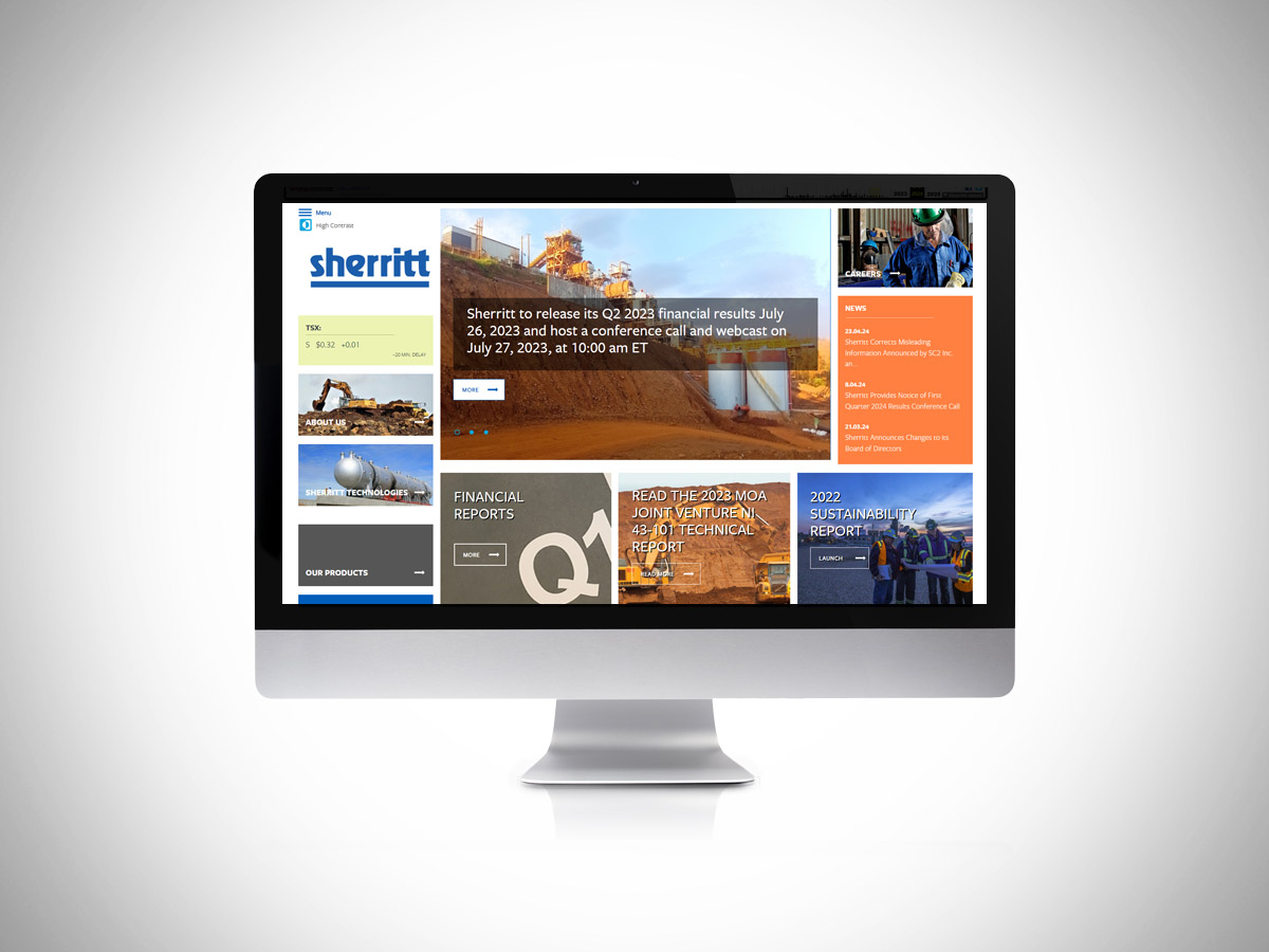 Old website (2024)
Anyhoo, I was engaged to give them a new content design/mini-brand refresh. The corporate presentation was part of this effort too. We agreed upon the base CMS and I started on the content mapping strategy with my collab partner, Hugh (He’s a talented strategic-thinker type of guy. You might like his help on your next big marketing comms project.). Then I got to designing in Figma with a small amount of prototyping to help explain the general UX experience before we dove into website building.
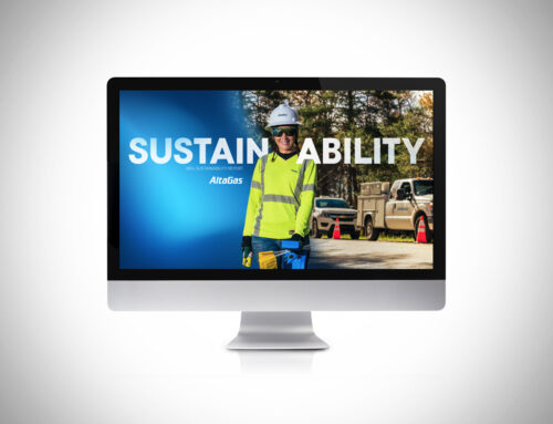
I also was the video editor/creator for the homepage banner section. Sooooo, ya, I do that stuff too.
The client wanted to emphasize their extensive industry experience and longevity while also communicating the real-world environmental stewardship they use as one of their core principles. We engaged a webdev team to fulfill the remainder of the web pages and the whole project was completed in less than 90 days.
End-result: Great initial internal and external stakeholder feedback, mostly saying “Wow, it’s so nice to be able to find what I am looking for on your website”. Some people mentioned that it looks and works great too. You might agree.
Or not. But that’s the beauty of designing with a communications purpose instead of just getting all artsy flash from your creative expert. I provide what my clients need and make it resonate with their audience. You were not my client on this project.
We should change that and work together some time…