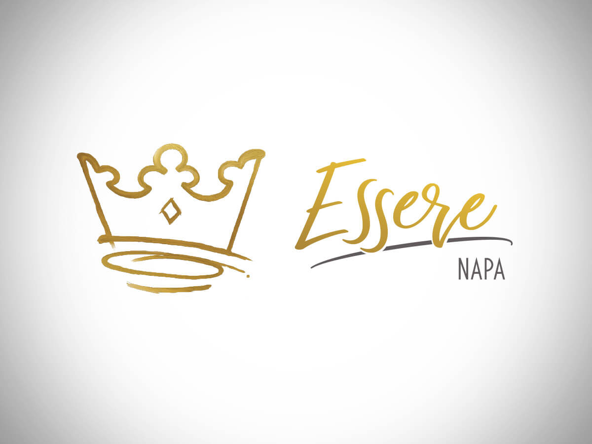
Essere Napa
Well, projects like this don’t come along every day. I was contracted to work with the new owners of a Napa Valley Winery to bring their brand up a notch or two. They had a fairly decent local awareness and an excellent cellar of wines, but were feeling that their legacy-minded branding was not helping them to reach new markets or younger, affluent demographics.
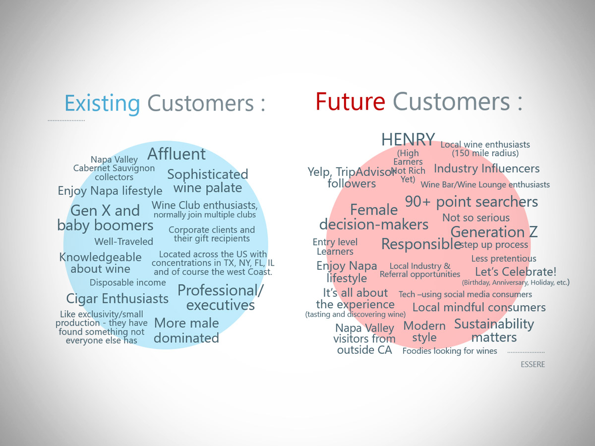
I met with them once remotely to discuss their aspirations and wants. Then I put together the initial creative design exploration that sparked further exposition of their marketing SWOT. Here’s a couple slides from that session:
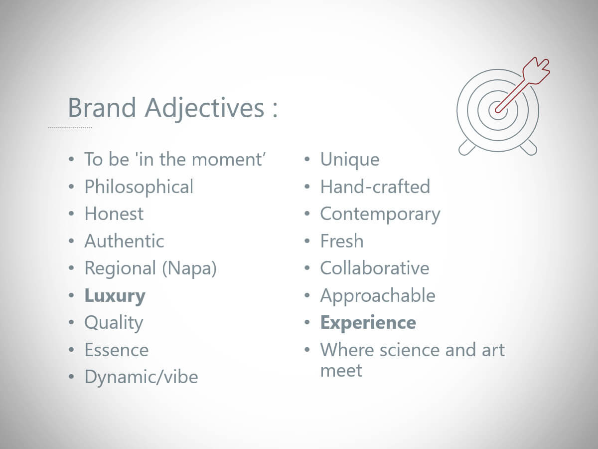
It’s always fun to see and hear the key stakeholders discuss the findings and agree that it’s not an option to simply “do nothing and expect something”.
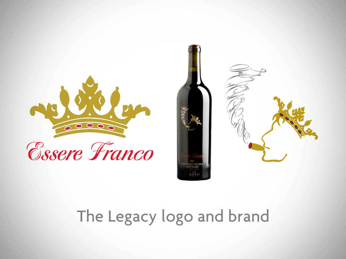
Anyhow, rather than just grab a mouse and fire up Illustrator, we worked together to define their target demographic and sifted through the many ways their existing logo, marketing and labelling was misaligned and perhaps not so effective in connecting with these groups. The Crown they had was a bit of a legacy icon for them, but the guy smoking the cigar was definitely a bit too low-brow for their elevated branding aspirations. They also wanted to leave the “old world Italy” vibe behind. The wordmark style and the name were also on the chopping block. Finally, they wanted a logo that could allow for all of their varietals (chardonnay, malbec, cabernet sauvignon and a proprietary red wine blend).

Now we had a more clearly-defined target and I went to work.
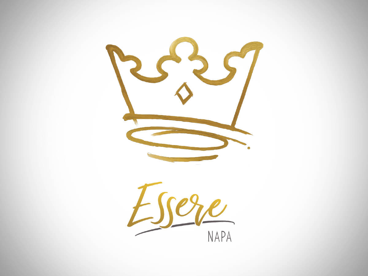
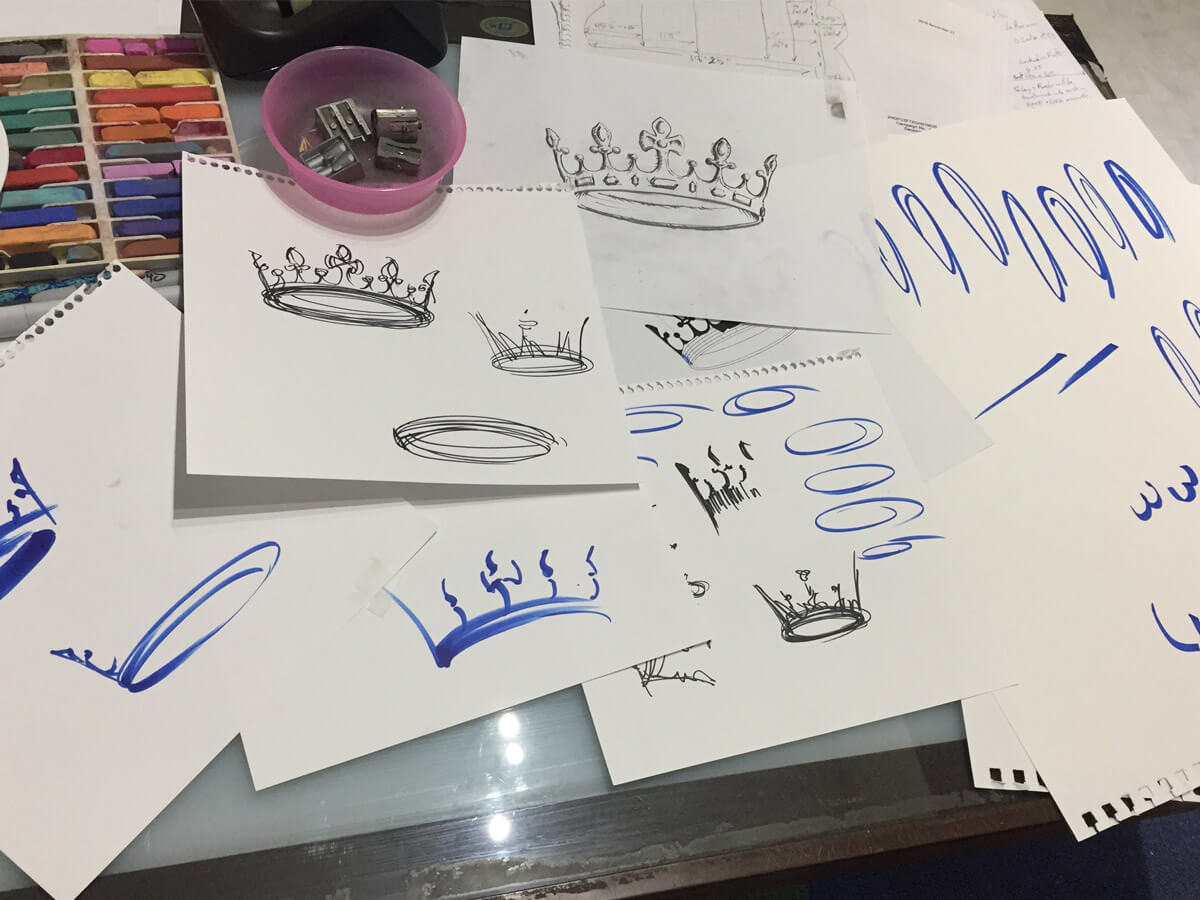
A big part of my design exploration was how to evolve/modernize or simplify the crown silhouette. I developed quite a few iterations of crowns and two images percolated to the top (see below). They liked both logo redesigns and couldn’t completely decide. So I was asked to expand upon these two to completion in order for them to perform their internal brand review before making their final decision.

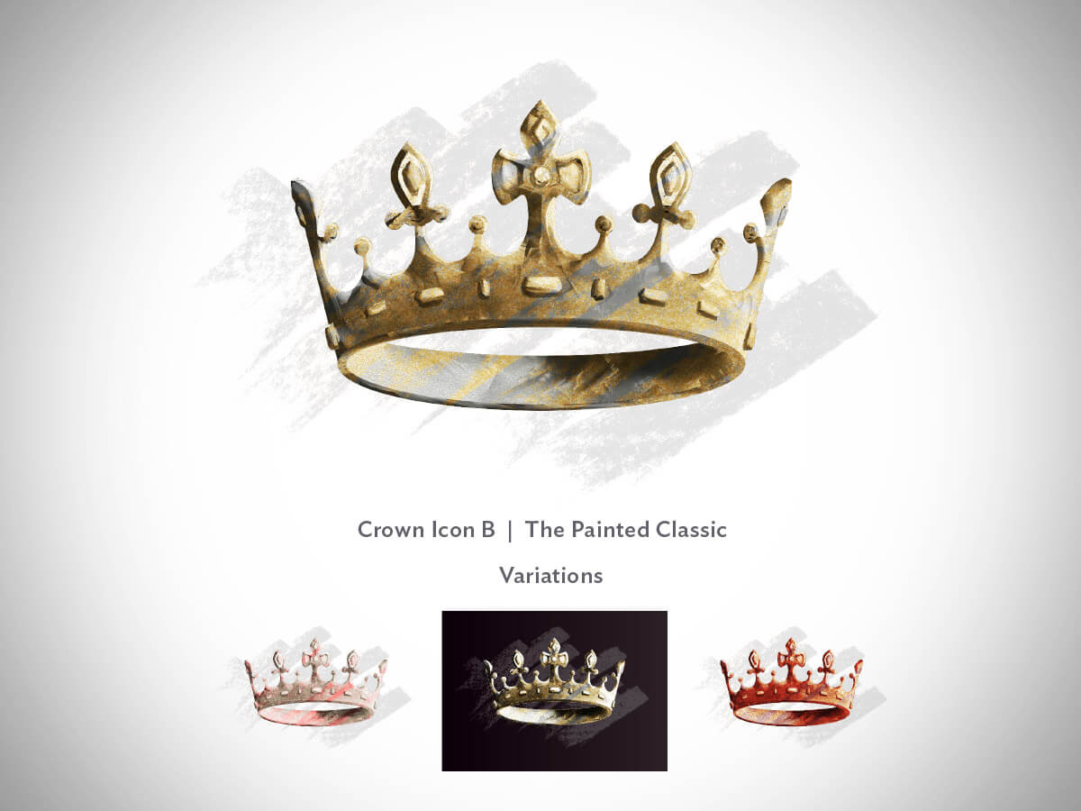
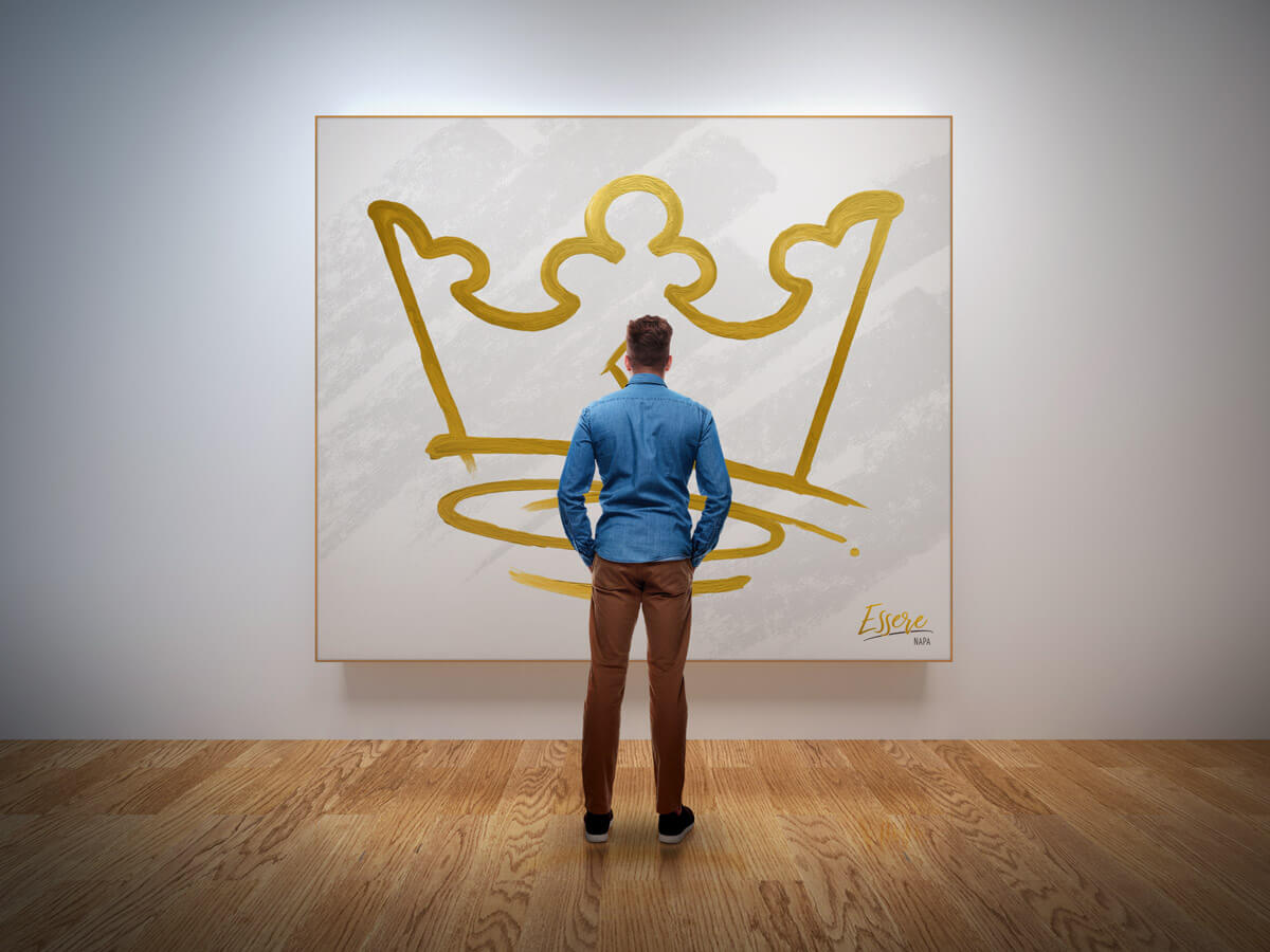
While they deliberated, I kept the marketing hat on and devised a backstory for the brand that the vintners could embrace and champion. I presented this rationale as if they were a collective of artists who put their works on display for the discerning clientele all over the world to enjoy. That’s where these little marketing visions came from.
Ultimately, they chose the cleaner, whimsical and expressionist version of the crown and we married it to a custom-crafted wordmark set.
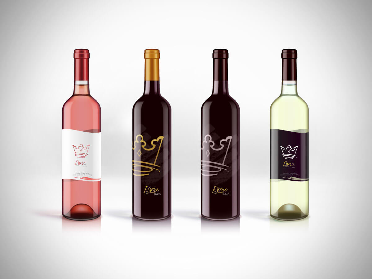
Since the launch of the new logo and brand, I have designed many labels, product sheets and vintner profiles for them as they continue to grow the brand. I am pleased and proud to have them as my client.
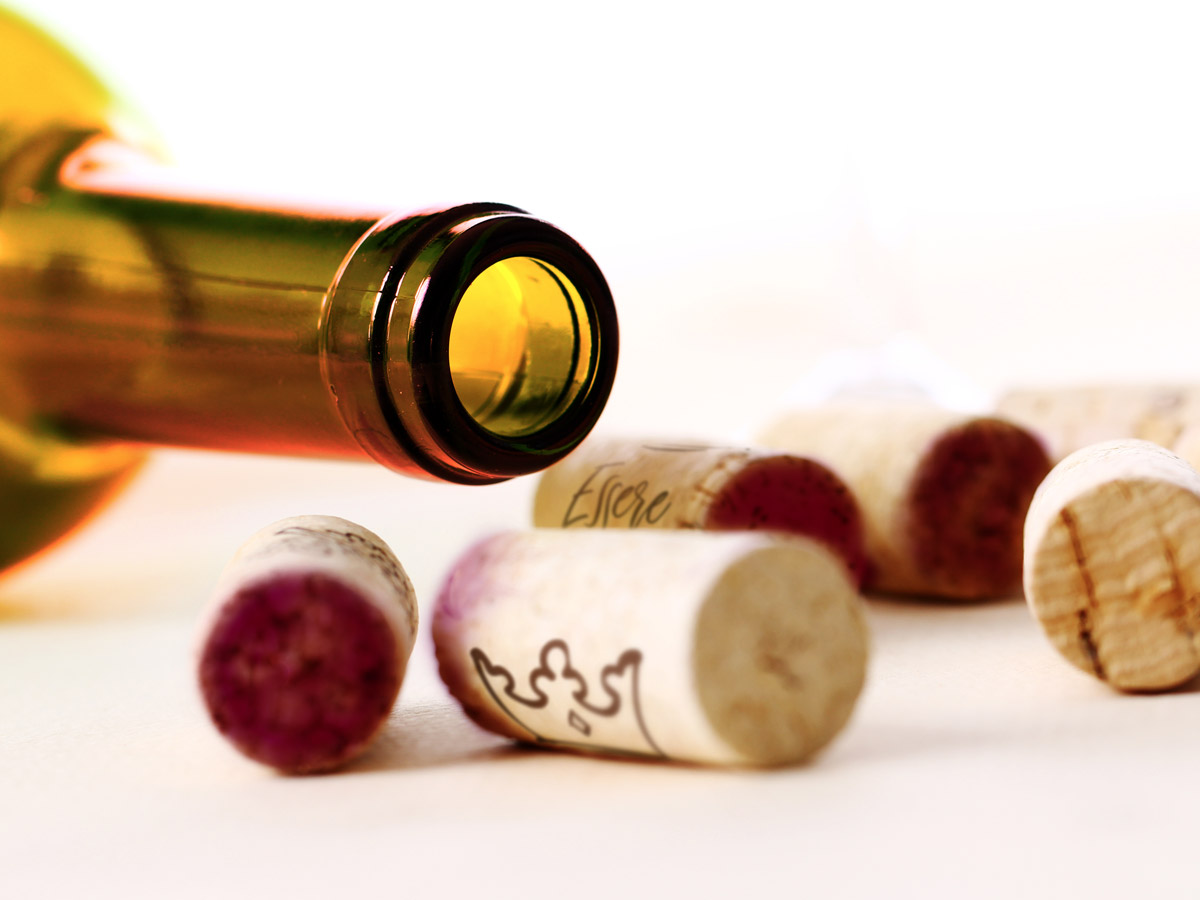
Did I mention that the wine is excellent?