Technical Illustrations and full PPT redesign
This was a nice little exercise in branding and improved corporate communications.
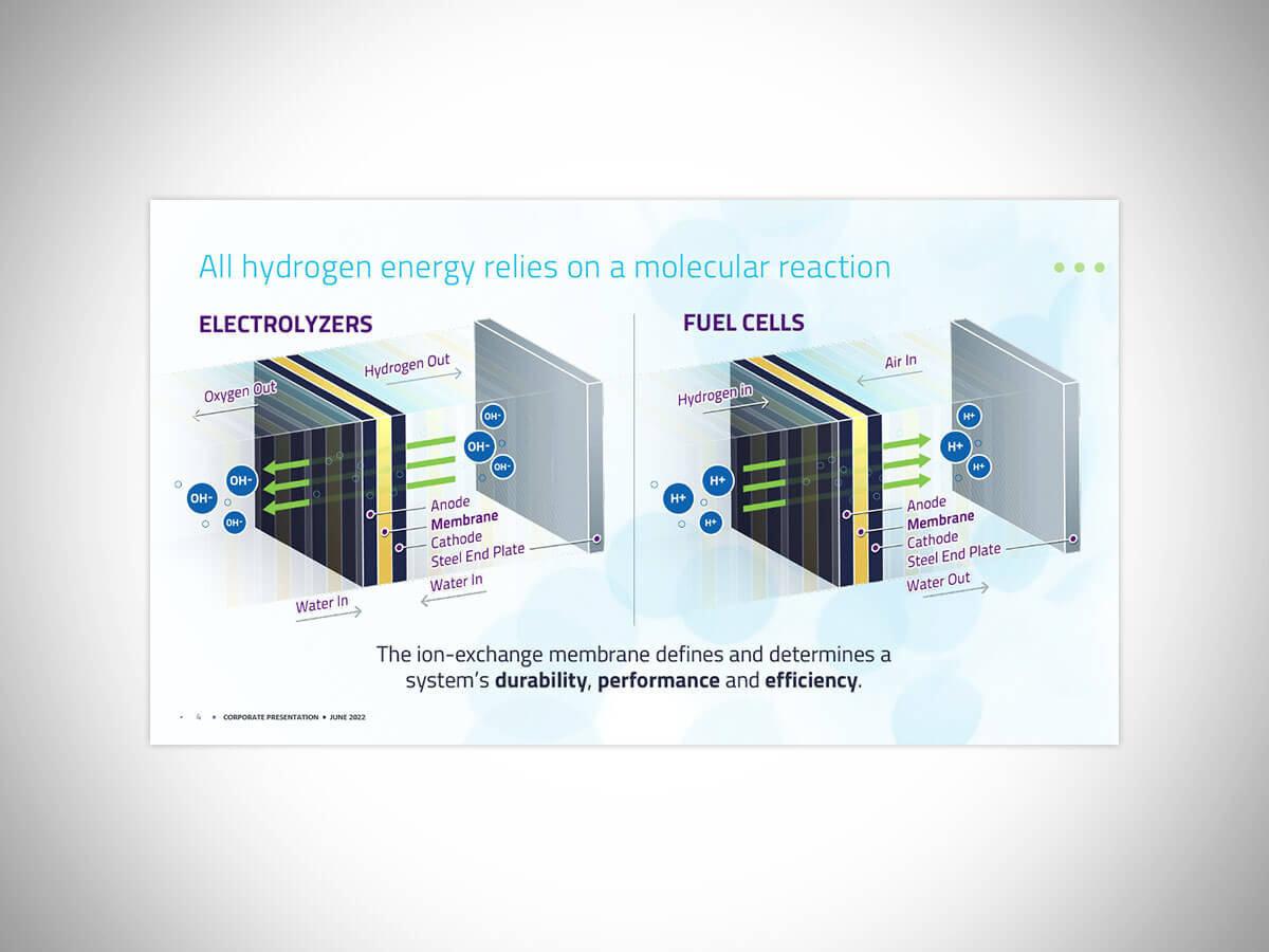
Phase 1: I met with the company engineers to have them explain their innovative processes, which is when we all agreed that the current illustrations on their website were actually technically wrong, from an engineering perspective (that probably didn’t help them sell their science). The new illustrations were devised in stages of opacity which helped to simplify what was happening at the molecular level. And with greater understanding comes a higher level of engagement and investor confidence.
Drag the centre cursor to see the visual stages of one of the illustrations I created below.
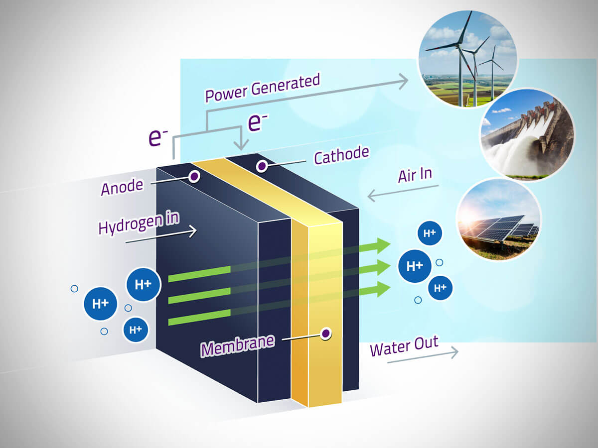 Fully-realized Schematic
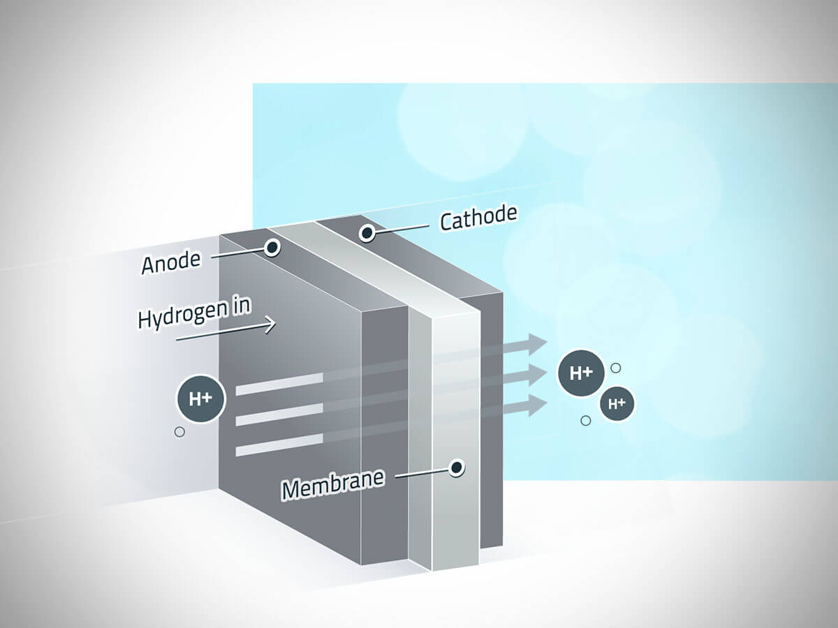 Simplified Schematic
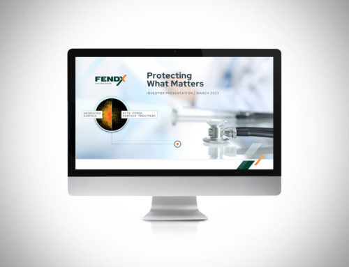
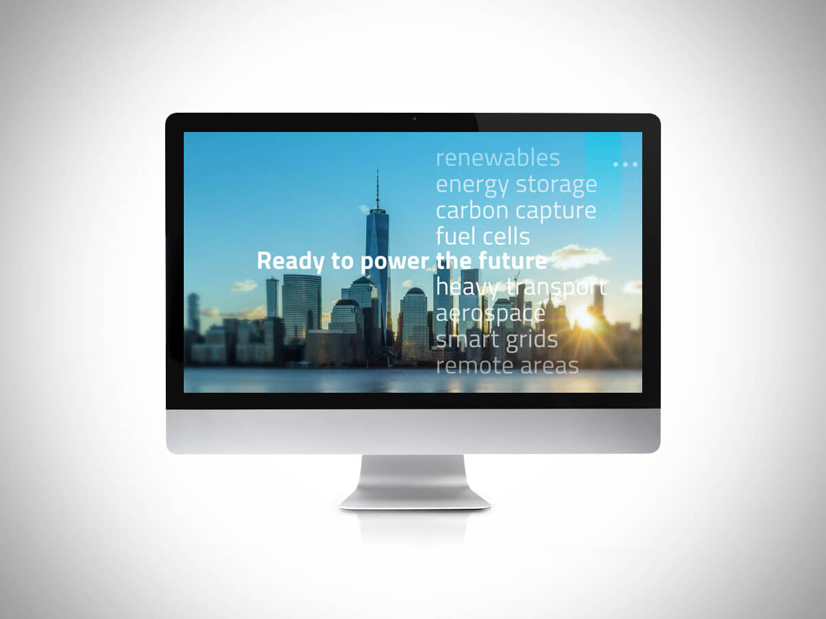
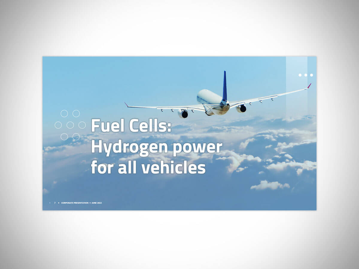
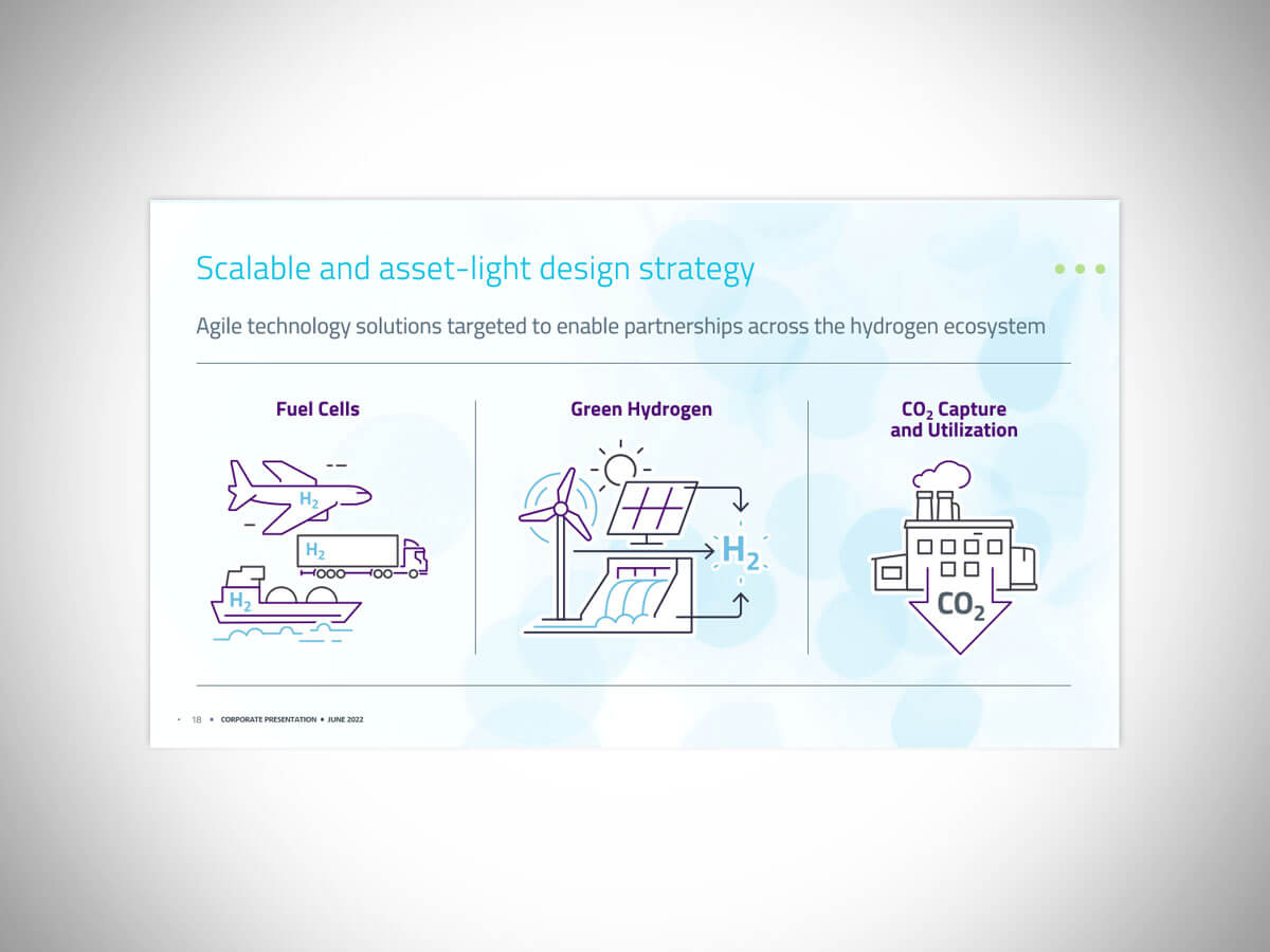
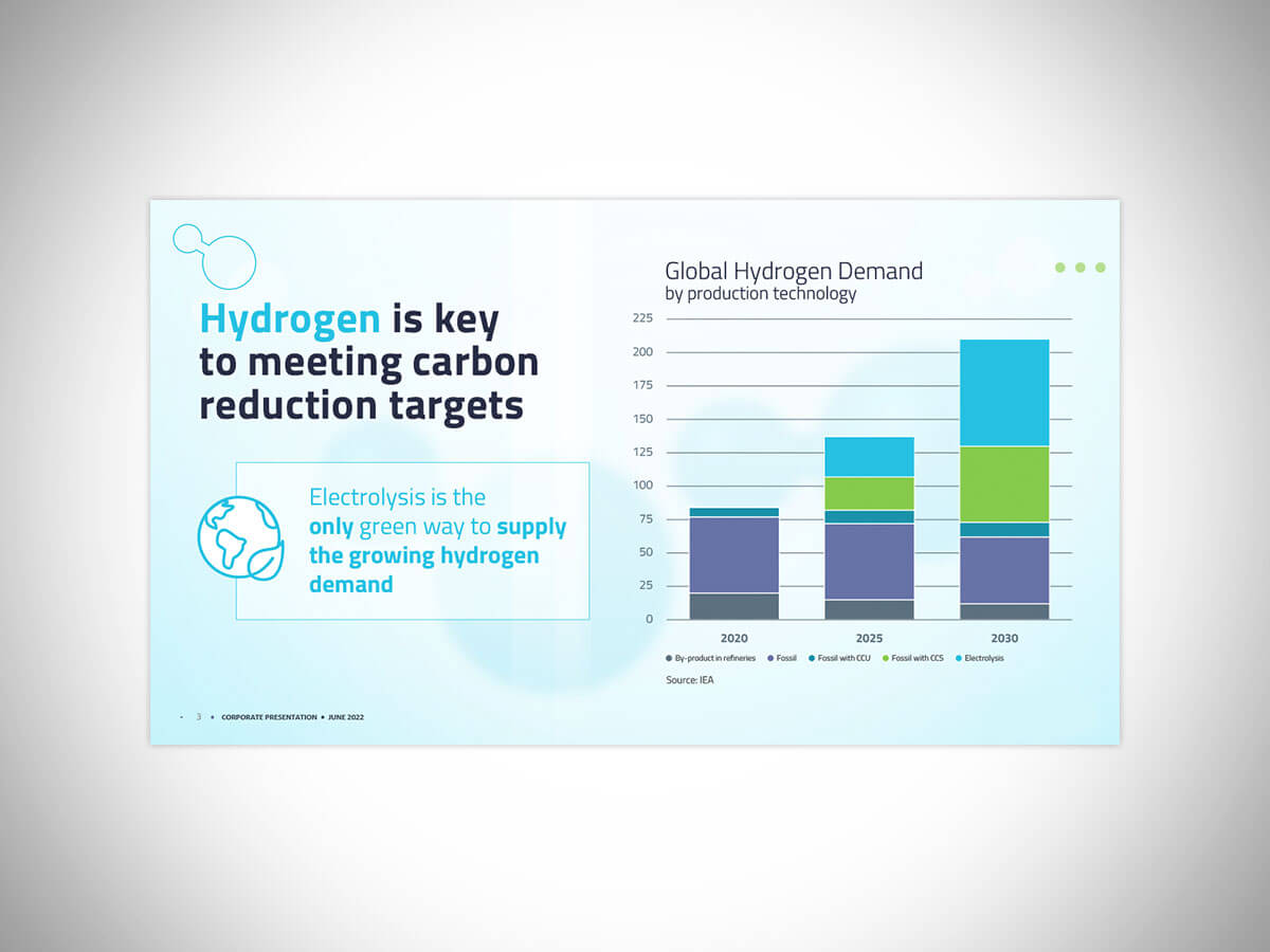
Phase 2: We devised a new storyboard for their presentation and dovetailed these illustrations into the content flow. I also created a fully-redesigned PPT deck, which served to focus their messaging for a more compelling investor pitch.