Project Description
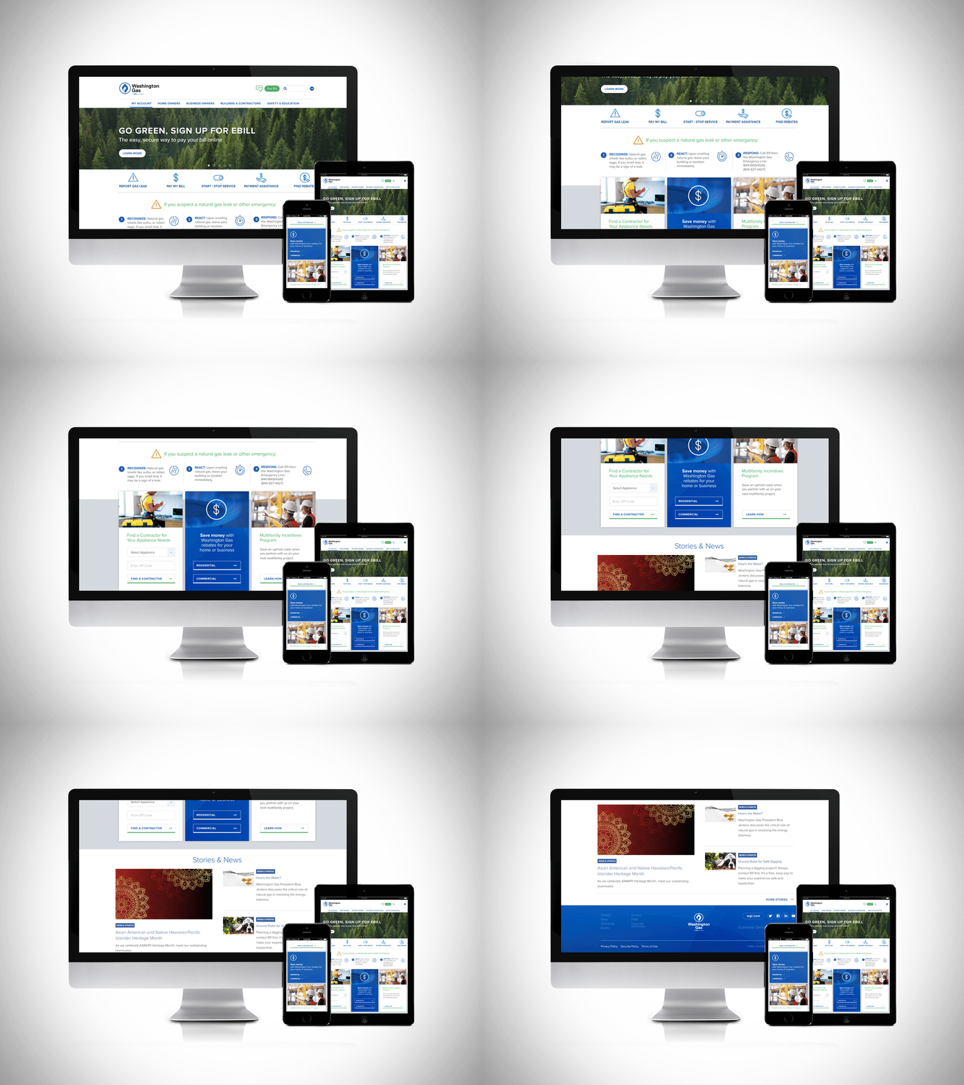
I was tasked with helping a D.C. utility provider to improve the UI and reduce clutter/wasted space on their website and make the homepage more immediately useful for the reader.
This is the website before I was involved →
You might notice that it basically looks the same. I was never asked to redesign the website*. To improve the UI, I designed a new “above-the-fold” section that gives the customer all the tools they need within a single row dashboard. Plus, the client wanted to demonstrate their commitment to safety by drawing more attention to the “gas leak report” section and then follow that up with the top three buckets of user-centric content.
The overall navigation scroll/click optimization was playtested and rated at ~35% reduction/improvement.
* I am not the content administrator for the website, so I can not take responsibility for how the website looks since the day I handed this design over to my client back in 2022. They have their own internal comms team for that.


