Website Design – OnGrowing Works Ltd.
Note: This write-up is a bit longer than usual, but I think it’s a great story of communication and collaboration. I hope you will agree.
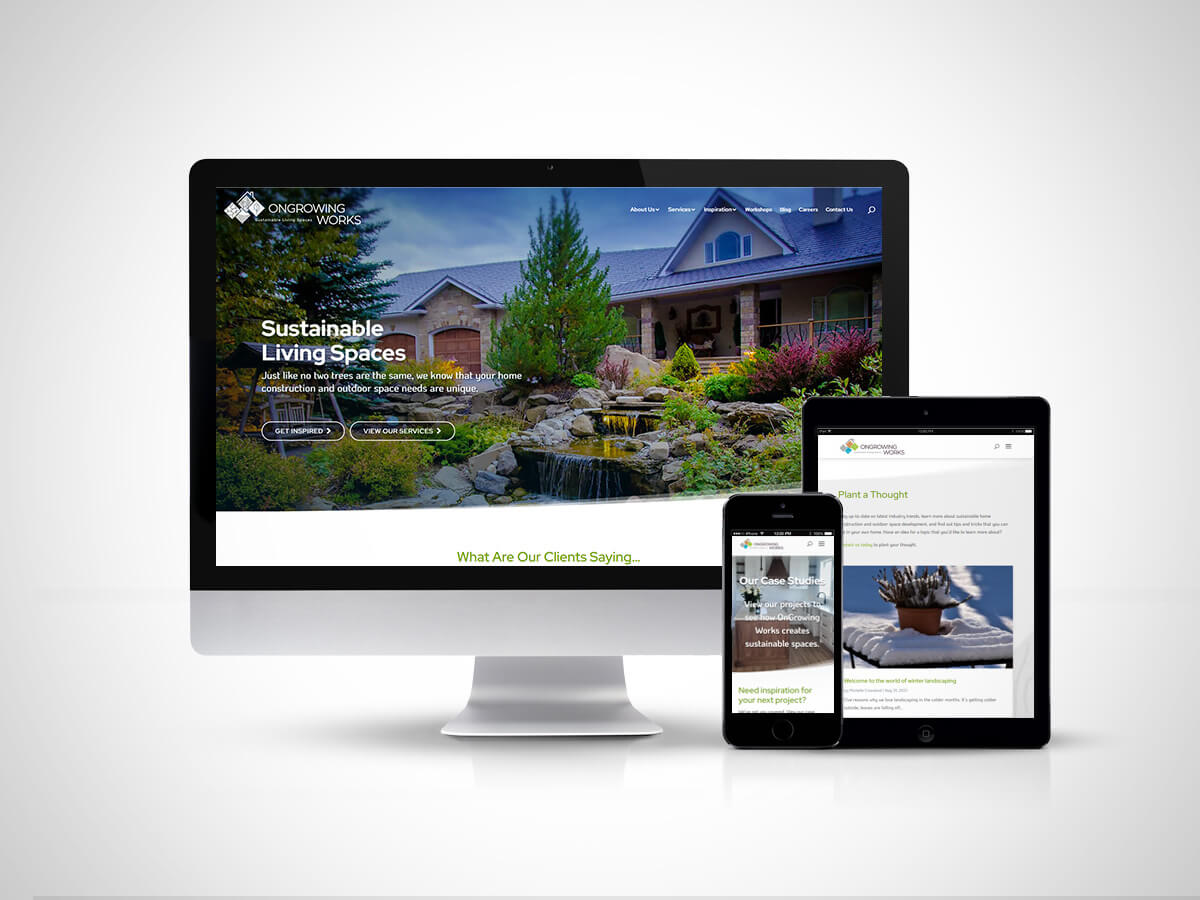
OnGrowing Works (OGW) is well-known for its landscape artistry and eco-sustainable solutions. They are a very talented and experienced group of landscapers and home-builders in Cochrane, AB. The company also has another side to its business, for which they wanted to increase market exposure to drive business growth. Basically, there was a two-fold opportunity to increase customer loyalty and move the bottom-line “up and to the right”.
Recognizing that the most useful marketing tool at their disposal was the company website, OGW engaged with a local media strategy consultation firm who brought me in to help strategize and implement a more robust website that served to promote their strengths and pull most/all of their case studies + portfolio examples back under their own roof (they had been trusting social media and 3rd-party review sites to tell their story… but that was obviously never something they could completely monitor/control). We targeted a few things that the new website needed to address:
- Design a more “premium-level looking website” to reflect their brand ideals (which, in turn, would resonate well with their desired clientele);
- Promote “Eco-sustainable solutions” to build customer engagement and media traction;
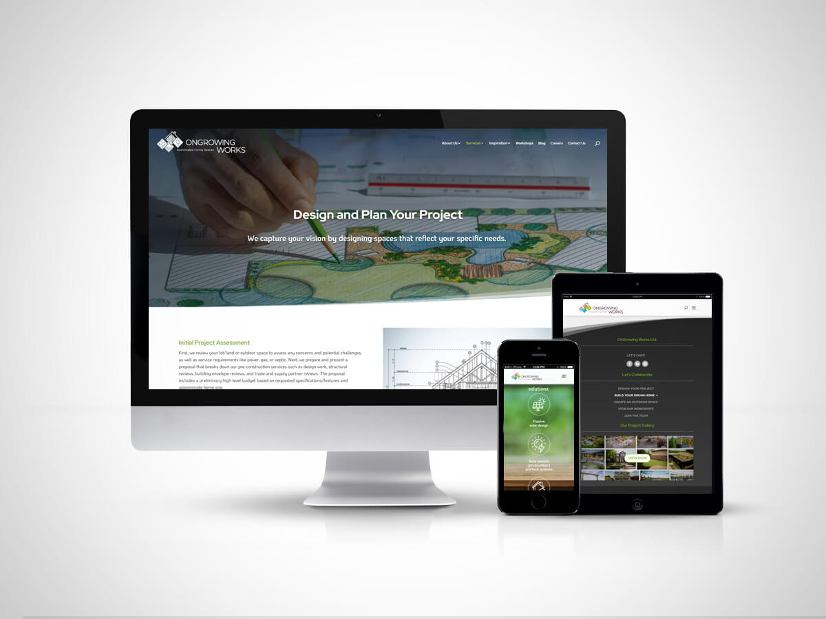
- Focus more time and attention on the home-building side of their business (marketing verbiage, dedicated website landing section and more building/planning stories for the blog section);
- Make the content easier and more engaging to read/experience;
- Showcase their great work using case studies and real-world examples of client engagement for the “win-win”.
Aside from designing and building the website, I was both pleased and excited to be involved with the Media Specialists on overall messaging strategy/creative. Among other things, I love how the design of the website was developed alongside the refreshed messaging… that definitely helped to tighten up the overall brand and marketing message for OGW.
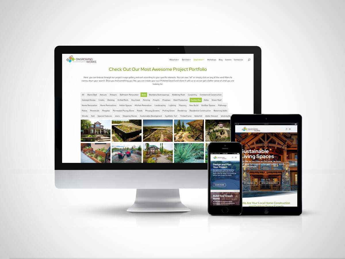
The client already had some amazing project photography, but it was so vast and under-utilized on the existing website (basically just an unsorted slideshow). The initial plan in the proposal was to recreate their online portfolio with an eye towards more visual punch and pizzazz. But, about 6 weeks after the initial budget and scope was approved, I was brought into a discussion about the possibility to do something bigger. My first thought was “Hmmm… seems a little bit like scope-creep to me”. But I took the time to listen and understand the client’s wishes and I made it part of my mission to create a better portfolio tool for them using customized WP plugins. You will notice that the Project Gallery is more “user-centric”, allowing for people to view/sort images according to their interests. Several of the images are also cross-linked to their expanded case studies, allowing for further use engagement. I also built in the ability for potential clients to contact OGW directly through the portfolio gallery, or even share the images via select social channels.
Did I achieve all of this within the same initial web-design/build budget? Yep. Did I render, optimize, tag, sort and upload the initial 60 portfolio images to make this online portfolio work? Yes… yes I did. I must give credit where credit is due, mind you. OGW’s internal Business Manager, Chris, did an amazing job in pulling the source files together inside of their Sharepoint cloud directory (tags and descriptions included). He did have to become a badger with his team in order to get further details on some of their images and subsequent case studies. I know that wasn’t easy, with less than 2 weeks to go to launch. I thank him for all of his time and support to get this portion of the website completed and I hope everyone knows how important he is to his team.
I also got to write some of the landing page headlines, which was never part of the ask, but I believe it helps to humanize a large company when they start speaking to people like something other than a big company talking to little customers. That human connection, incidentally, is also part of the company’s brand and tone-of-voice. And the owner, Bruce, lives it every day. That is why I was so keen to bring it to life on the site.
As always, I put in a little bit of the “project manager” role, because it always helps to have a shopping list when you have a deadline looming. When the site went live, I also took the client and their blog writer on a tour of the backend CMS, answering as many questions as possible to help them feel confident and equipped to perform their own updates once my role as a creative designer was finished. I even set up unpublished web pages for each of them to experiment within, so that they never had to feel the pressure of modifying a live web page. Let’s face it… the best way to learn how to build something often involves breaking it first.
To sum up: great client + great project + great communication = great result.
View their website here ».