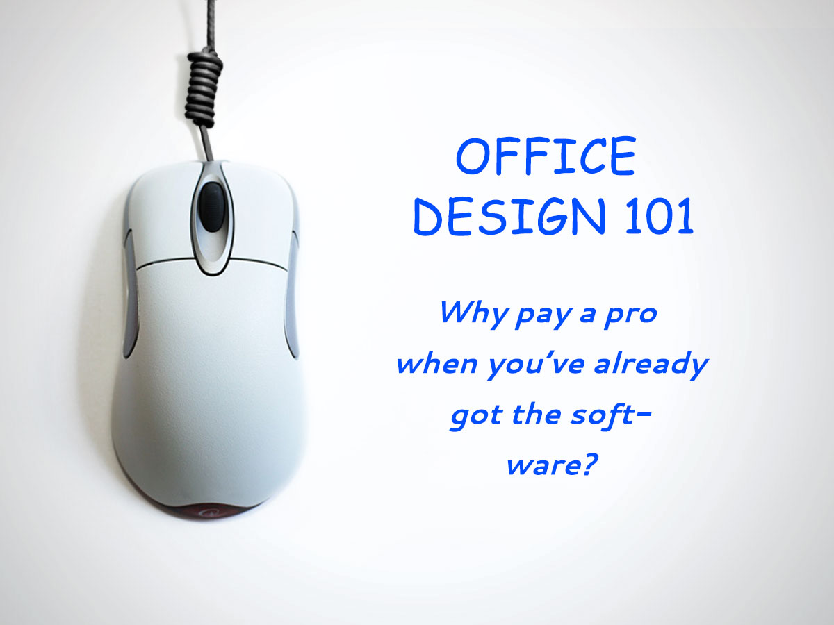
Welcome back. This is my second post on tips to help you elevate your design skillz using the Office Suite.
If you missed the first post, it’s all good, because you’ve already got the software suite that will make professional designers obsolete anyway. Don’t worry about learning how to be a better designer… just let the software and “templates-a-plenty” do the work for you.
This post is all about proper word hyphenation using PPT.
Take a look at the following image and see if you notice anything wrong.
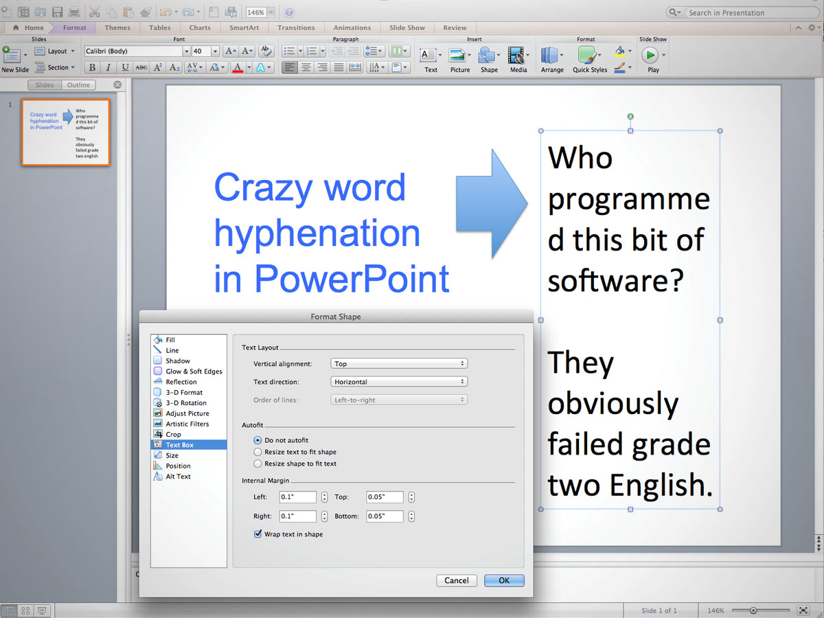
Everything is set up properly and according to spec, as shown.
Punctuation and grammar are good…
Are the words spelled wrong? No, that’s not it.
Is the font too big? Get serious for a moment. Remember… we are using PPT and there is no such thing as a font that is “too big”.
I bet you are thinking that the word “programmed” has an accidental space before the “d” (programme d). Nope. PPT has the god-like authority to take words that don’t fit into a box and break them in any way it deems right. That’s ok, because the software says so!!
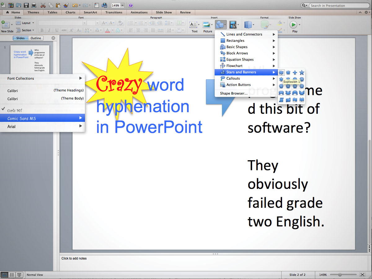
If you are frustrated by this flagrant disregard of previously-acceptable writing standards, you could try to fix it, but that could lead to time wasted fixing something that PPT has already told you isn’t wrong. So why not try using the awesome science of designed distraction, like so:
- Choose a font to “emphasize” the meaning. I used “Curlz”, but Comic Sans is always a good alternative.
- Give that font a different colour. Preferably something that shouts.
- Add an eye-catching shape, like “Explosion 1”.
- Don’t forget to add the glorious “drop shadow”.
And there you have it. We started with an initial little problem of a poorly-hyphenated word. Now, it virtually disappears as the eye is drawn into the vortex of a visual junky-starburst mess*. All without having to spend any time attempting to go against the will of the all-powerful PPT software. Heck, I will guarantee that you can make something even more distracting if you try exploring all of the visual built-ins that PPT has at the ready.
But should you?
* Junky-starburst mess is not a trademark, so feel free to use it to describe anything you see that employs visual callouts that go against natural selection or just seem wrong.


Leave A Comment